Creating EiTM’s Website & Logo
By Laura March

The opposite of EiTM’s digital aesthetics. GIF from Creative Market (2017).
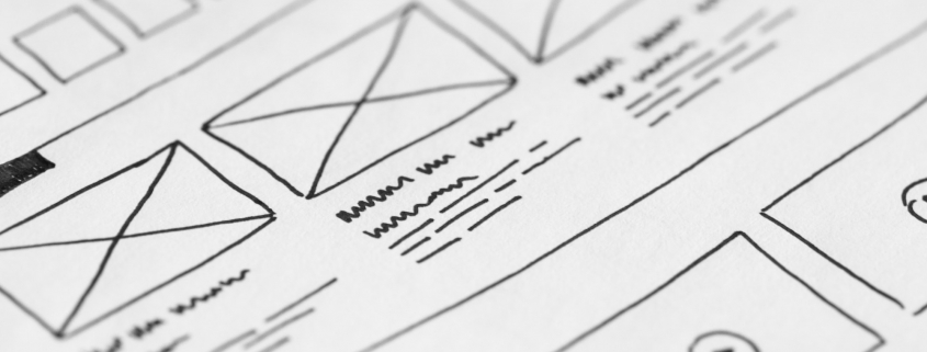
One of my projects this semester was creating our lab’s logo and website. While some may think an online presence can be slapped together in an afternoon using free tools, taking the time to analyze and design a polished digital identity at the start saves headaches (and money) in the long term.
I started this project by asking my fellow lab members to collaboratively fill out a “Pre-Build Questionnaire” I developed for this purpose a few years ago. Questionnaire answers, combined with Dr. Melo’s aesthetic preferences, translated into the site’s focus on clarity and simplicity. Visually, this can be seen in our black-on-white color scheme, modern typefaces, and a simple logo that combines a LED graphic directly into the lab’s name. Potential accessibility oversights (like color contrast issues or screen reader errors) were checked and accommodated throughout the process using WebAIM’s WAVE tool.
We were also lucky enough to be able to use Carolina CloudApps to host our own instance of WordPress, allowing us the freedom to choose a theme and plugins. Using WordPress (the most popular content management system on the web) with a regularly updated and established premium theme ensures we will have the features (and technical support) needed for many years to come.
Some of the features from the custom plugins and theme we use on this website include:
- Email subscriptions – see the “Sign up for News & Updates” call-out below and enter your information to receive updates delivered to your inbox.
- Twitter RSS feed – our News page automatically collects and shows tweets with the hashtag #NSFEITM.
- Portfolio pages and filters – see the 2020 Bibliocircuitry Project pages for more.
What do you think of our website and logo? Is there anything you’d like to see us change? Feel free to get in touch and let us know your thoughts.


